2019 is off to a great start. While working away on projects and trawling the internet for inspiration we are seeing a plethora of trends emerge. Our 5 design insights bring these trends together, which we think will continue to shape this year for brands, graphics and packaging design.
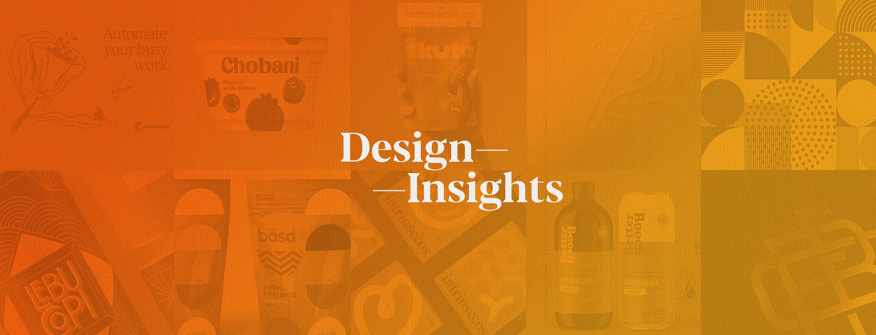
1. Alternative Abstract Art
Not that classic illustrations are ever going out of style but somehow incorporating alternative art into the graphic design makes the piece stand out. Freestyle illustrations and doodles are definitely fun to look at and add a lot of personality to a brand. The great thing about alternative art is it allows us to tackle more cerebral abstract concepts without having to be so definitive or precise.
Mailchimp rebrand by Collins, Intrínsecos by eStudio Pum
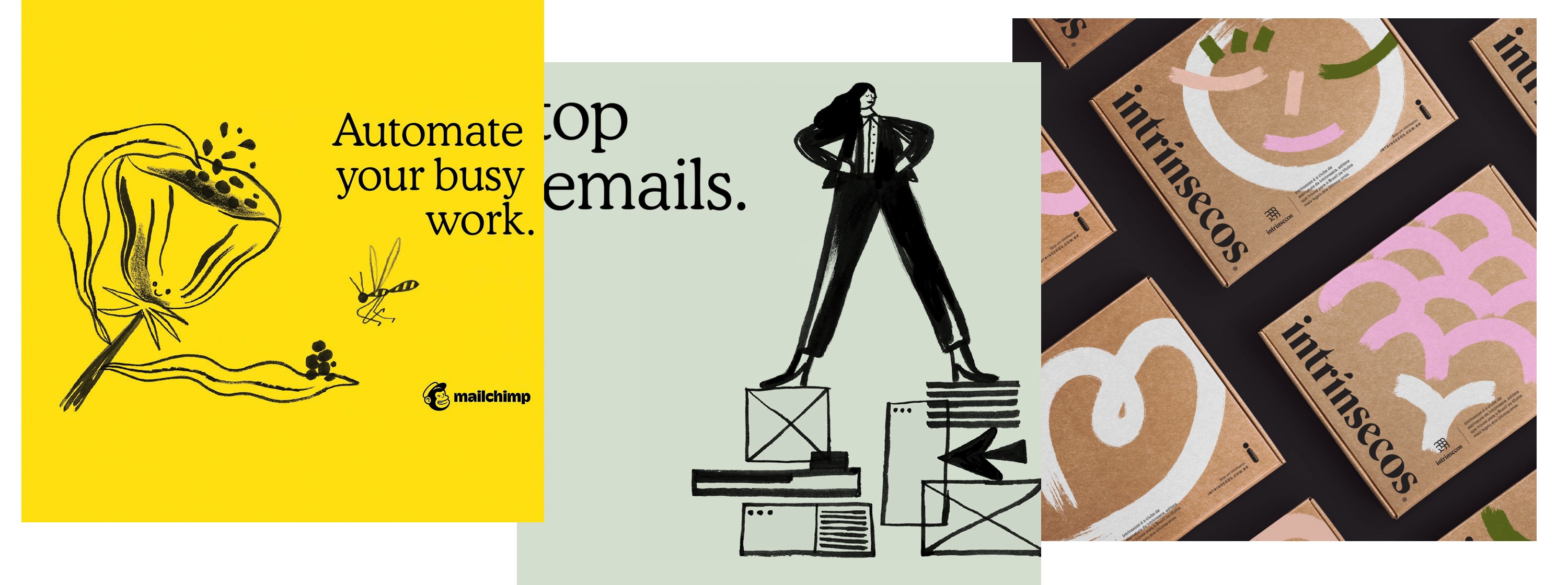
2. Realism + Flat design elements
Have you heard that opposites attract? Graphic designers have always been combining and mixing complementing concepts in order to please the viewer’s eye. Real-life objects combined with completely flat visual elements create focus and tension. A great way to highlight a brand or product.
Skuta Packaging by Dossier Creative, Buco Coffee by Molton, Vincit Beer by Marcos Vincit
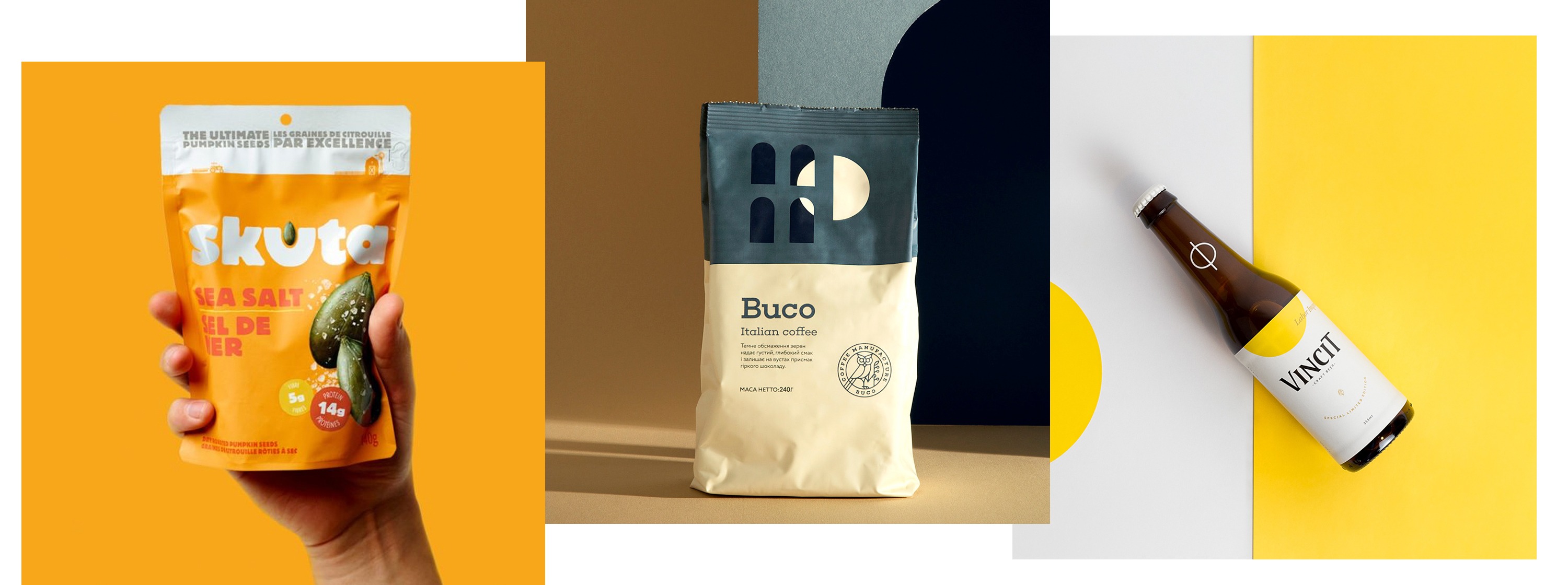
3. Art Deco Detailing
We’re seeing this emerge more often in logo work. Designers are embracing the complex line-work intense symmetry of the era’s best work, while combining it with sharp metallics. These designs feel opulent and luxurious and talk to connectivity and complexity.
Lebu Copi by Craft & Co, RGF Integrated Wealth Management rebrand by Dossier Creative, Sandpiper branding by Dossier Creative
4. Bold Breakthroughs
The mantra “less is more” has dominated design in recent years. Clean, uncluttered visuals become even more necessary for viewing content on smaller screens like smartphones and tablets so we’re not surprised to see a resurgence of strong geometric shapes that have maximum brand impact.
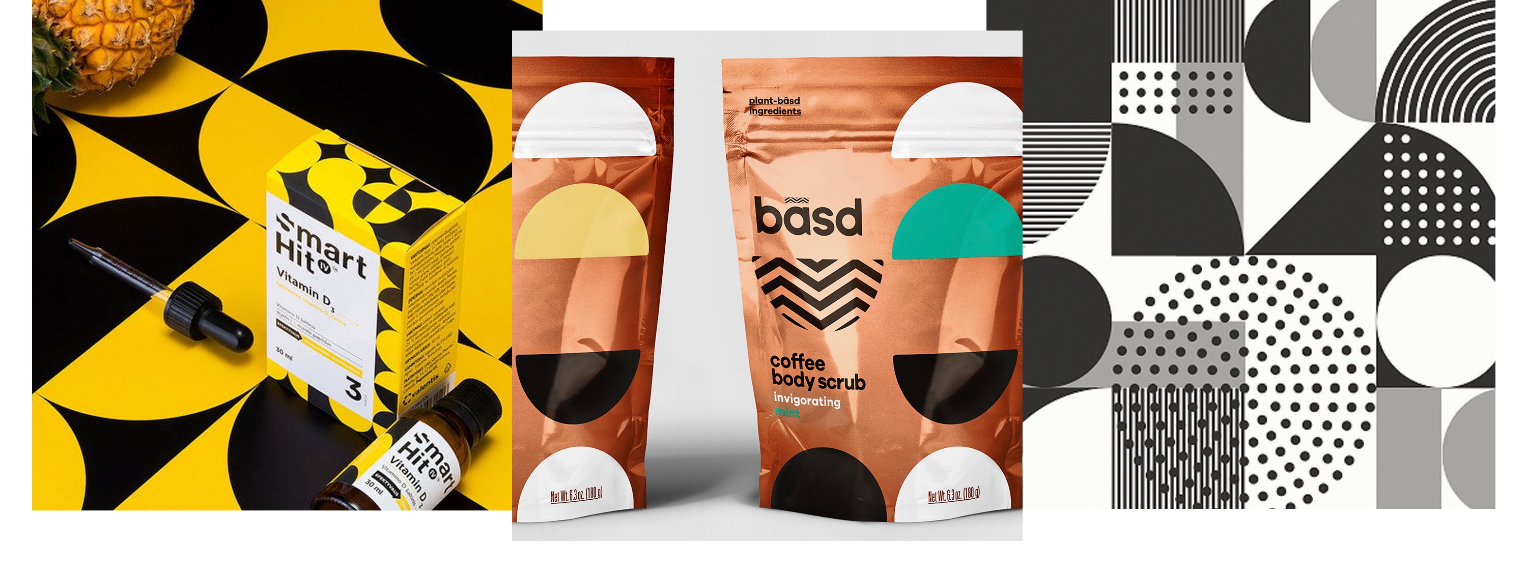
Smart Hit Vitamins by Critical, Basd Body Care by Dossier Creative, Nomad Pattern by Andrew Littmann
5. Slab Me With a Serif
Fonts are beefing up—especially when it comes to serifs. Custom type is becoming more and more necessary for brands that really want to stand out and increasingly a signature serif type or logomark is what designers are turning to. Why? Because after years of dominance by the clean sans serif fonts, the serif is now the horned-rimmed glasses of type – seen as quirky cute, smart, and bursting with personality.
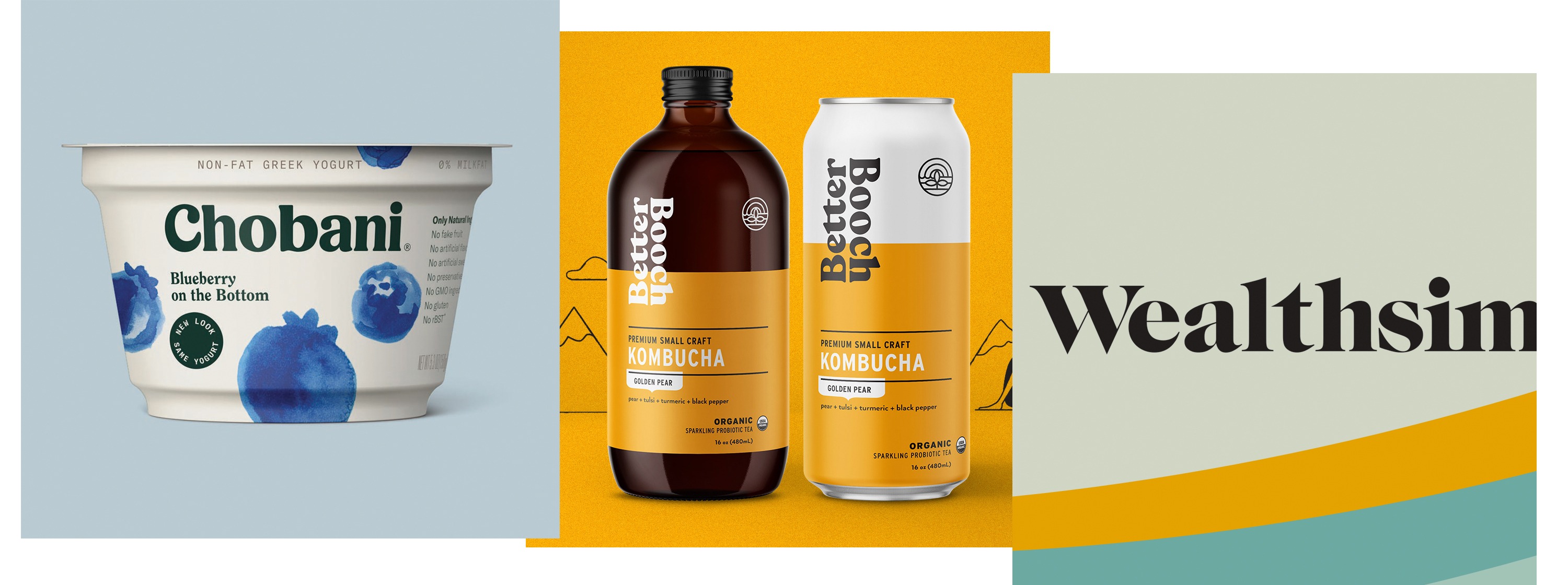
Chobani Yogurt designed in-house, Better Booch by Farm Design, Wealthsimple branding designed in-house
Our design insights have come from studying the latest trends in design. While trends come and go in all industries we have to be careful not to fall into the pitfall of following them too closely as this will date our work almost instantly. We should use trends as design inspiration for creating something more timeless. We hope our insights have been helpful. We celebrate and look forward to seeing what incredible work is created this year. Make 2019 the year you create your best work!