
Focal Point Coaching
How to rebrand for franchise retention and growth?
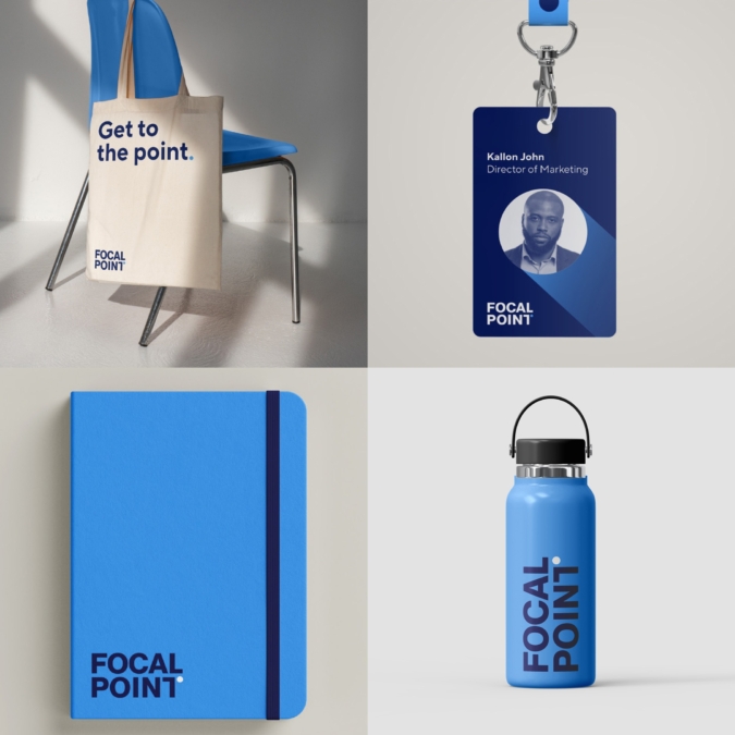
Get to the point
A franchise model platform for business coaches throughout North America, Focal Point came to us in need of a rebrand to help support a new era of growth, helping them reach new audiences while supporting the brand’s existing franchise network.


Focal Point began 20 years ago, with courses and techniques inspired by celebrated business author Brian Tracy. Today, the platform’s business coaches offer their support throughout Canada and the US, helping business owners direct their energy efficiently, gain perspective on their vision and develop a clear roadmap for achieving their goals.
Since its founding, Focal Point has built a network of over 200 business coaches attracted by the techniques and values of the coaching program. But in 20 years Focal Point remained unchanged, without evolving to accommodate the brand’s steady uptick. Something needed to change.
A rallying point
When we kicked off the design ideation process, we started by asking, “what if the visual ‘point’—the dot, the period—was the hero of the brand?” Of course, many other design ideas were tried and tested. But in the spirit of the poet Allen Ginsberg’s oft-quoted expression, “First thought, best thought,” we kept coming back to our first idea: the “point.”
It worked on a strategy level too. As Focal Point coaches know well, so often businesses start with a passion or a dream.
But take that original starting point and water it down with external market pressures, spread it thin with organizational inefficiencies, or sell it down the river with misaligned priorities, and you have the muddle that so many small businesses find themselves in. At the core of the Focal Point is an effort to help owners get back to the point they originally envisioned for their business, and get going.
So, to anchor the new brand vision, we landed on this simple phrase: “Get to the point.” A gentle prod for meaningful action, this phrase would serve as an overarching idea to govern the new brand system, keeping things fresh, bold, and clear.
Getting going
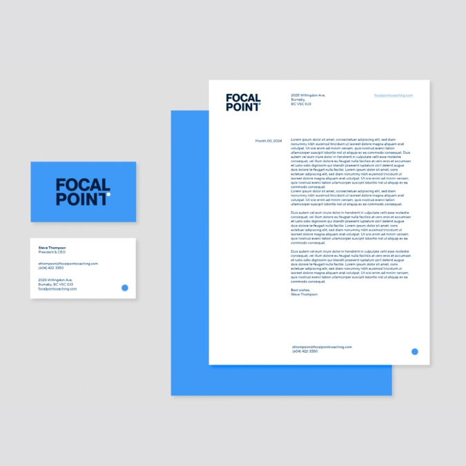
From there, we created a visual identity with the “point” as the key graphic device, a symbol representing precision and the completion of goals. Cool blue shades and modern sans-serif letterforms lent freshness and clarity to the brand, a sense of renewed beginnings, with the “point” forming the right arm of the wordmark’s “T.”
Finally, the “point” naturally lent itself to a new minimal logo, a graphic abbreviation of the brand name. In our line of work, design choices aren’t always obvious, but this one was.
Modernized, yet with an eye to timeless efficiency, the new identity was simple and lean enough to allow numerous iterations across the brand’s franchisee partners.
Updated to reflect a renewed energy, reinforcing a central message throughout visual and verbal expressions, the Focal Point brand was all set to serve a new era of the same inspiring results, just more to the point. A guidepost. A turning point.


