Body Energy Club
How to refresh a local favourite for accessibility and on-shelf presence?
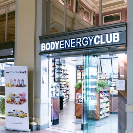
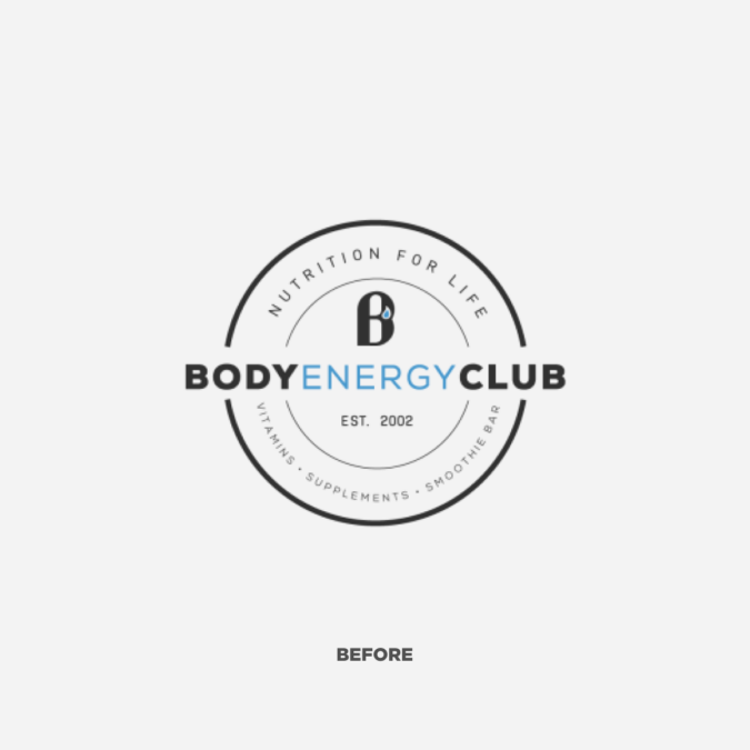
Founded in the early-2000’s, Body Energy Club had established itself as a local favourite in Vancouver, offering an array of smoothies and supplements for health-conscious Vancouverites. For a long time the city had a reputation for its wellness-pursing and fitness-avid residents. And Body Energy Club had managed to tap into that collective spirit, all with a booming online store and locations popping up in Los Angeles and Chicago to show for it. But as contemporary health and fitness outlooks have shifted from a more exclusive, diehard mentality to embracing a wider perspective of more personalized active lifestyles, their own brand and private supplement label had started to age. Health isn’t an inside club anymore.
Clearing Things Up
Teaming up with Dossier, Body Energy Club looked to modernize their brand and private label packaging to better compete in their own stores and reflect the more fluid lifestyle sensibilities of their current consumers, while contributing on-pack clarity and brand recognition across all branded merchandise.
Simple Does It
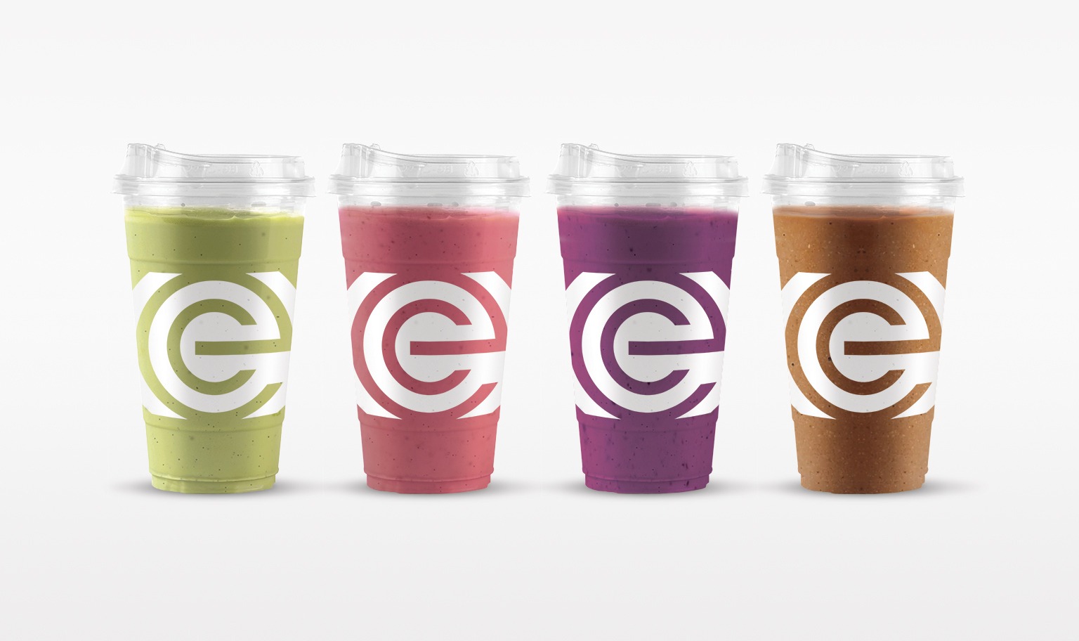
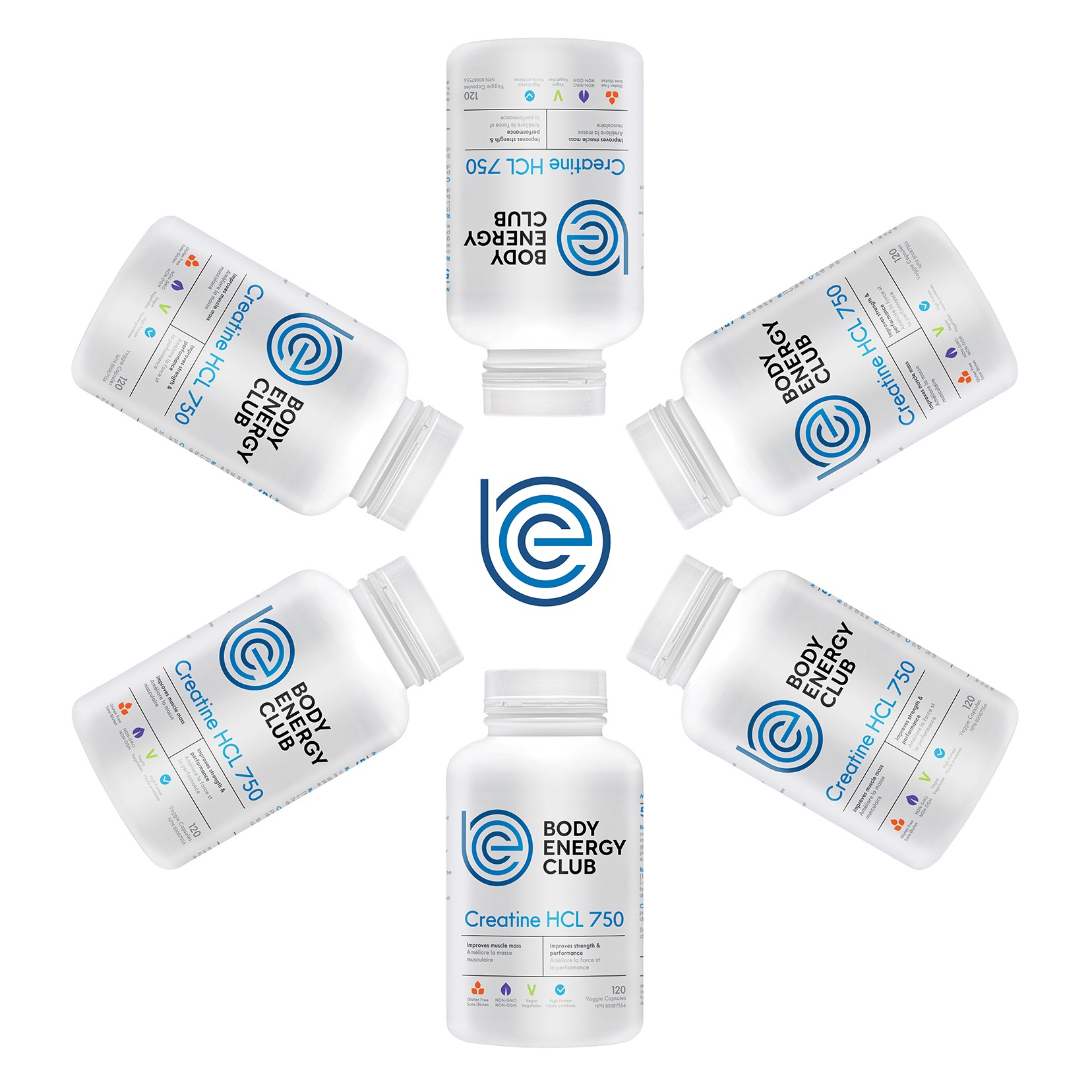
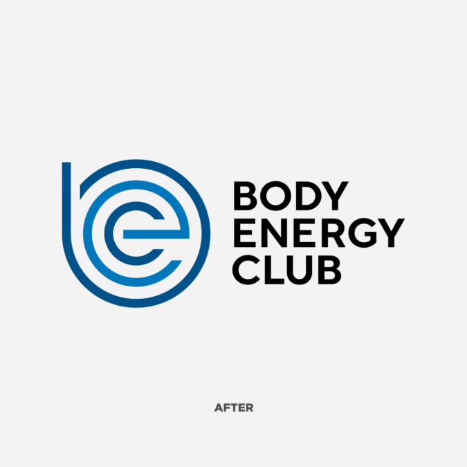
To maintain the integrity of the brand roots, we kept the white-and-blue colour scheme, incorporating the thin linework into a logomark combining the brand’s initials, BEC, optionally paired with a simplified wordmark. Whereas the previous club-inspired logo tended to recede on shelf, the refreshed design balanced simplicity and abstraction for improved visual clarity, in store and online.
Branching Out
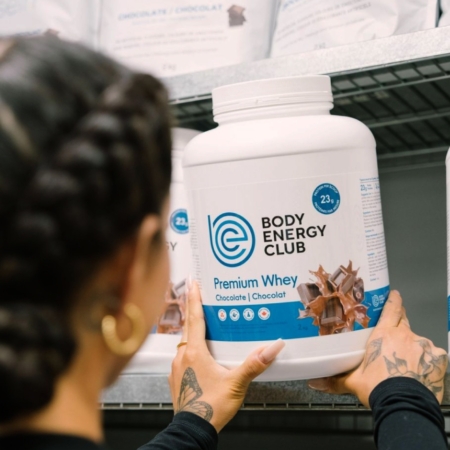
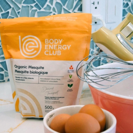
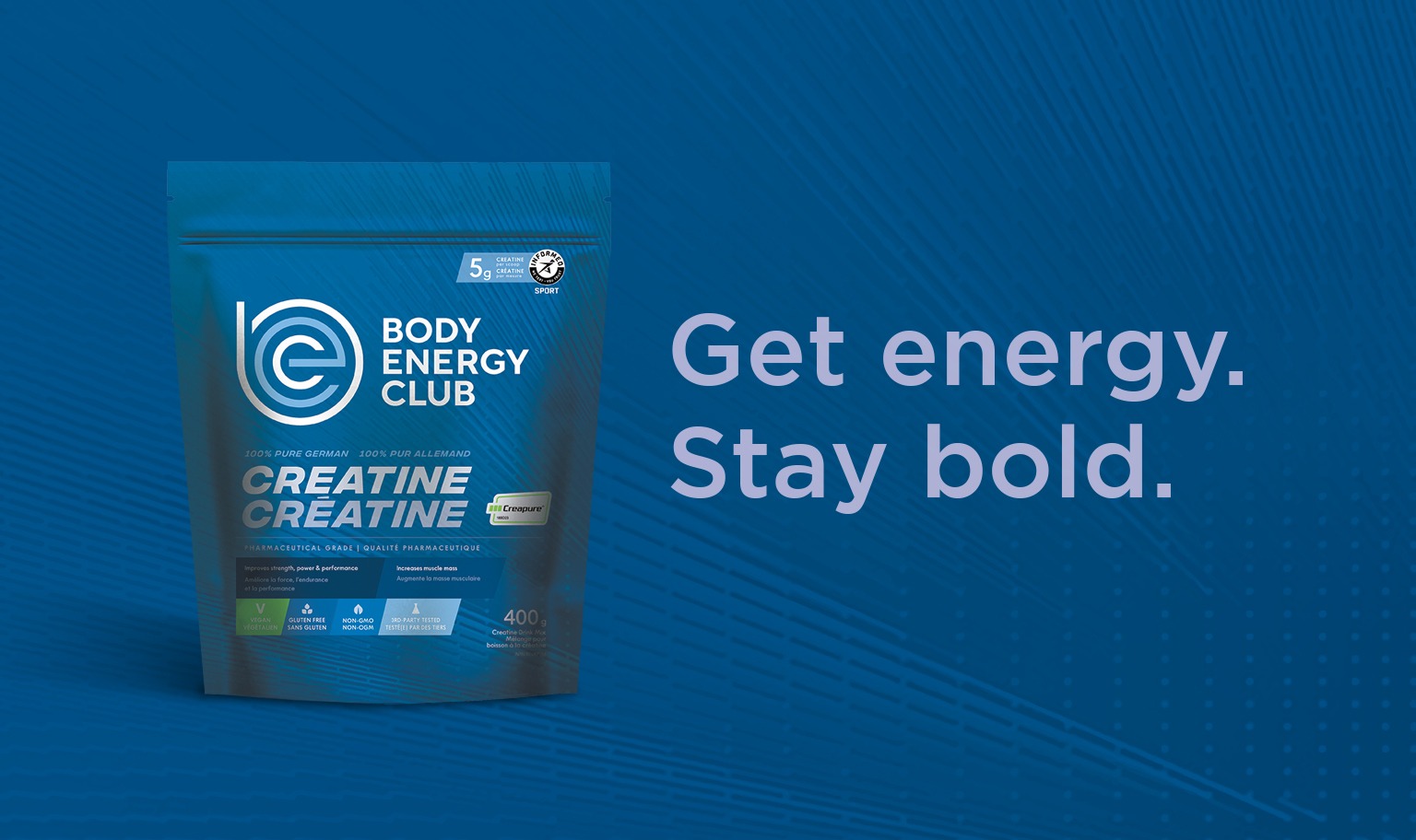
Across a wide range of SKUs, we amplified the brand’s distinctive blue to avoid the more clinical feel of white-dominated packaging, while boosting product photography for a bigger splash of colour. For select organic superfoods, like maca and mesquite powder, we introduced a unique colour system to diversify the brand’s product architecture. Finally, we utilized form factor and systems design to better organize every label for accessibility and legibility, with an intuitive flow of product messaging further adding clarity and recognition for the private brand’s in-store presence.
Lookin' Fit
As Body Energy Club continues to roll out their new branding and packaging, it’s been a pleasure to see them grow into their fitter, more welcoming, more confident selves. It suits them.