Organika
How to retool a brand for warmth, love & future growth?
After the global pandemic reshaped the world and our collective nervous systems—it’s no surprise consumers have been looking to the wellness category for solutions and, let’s be honest, emotional support.
Enter Organika, one of Canada’s No. 1 supplement brands—looking to connect with their audiences in a bold new way with a complete brand rejuvenation.

Growing Pains
Organika came to us with a problem most companies would be envious of: Over their +30 years of operations, they had developed leagues of devoted consumers, and led the charge of product innovation in their category.
Now, they wanted to consolidate what was working and clean up what wasn’t with robust brand guidelines to help steer the next era of growth.
Tapping In
Organika had come a long way from their original (very 90s) tagline, “Truth in a bottle.” But with growth came a brand look and feel scattered across a large product bank and multiple creative iterations throughout the years.
To guide future development, we created the anchoring positioning, “A wellness company to lean on”—uniting the high standards of quality-testing every Organika product is vetted by, as well as their brand promise to be there for consumers through it all. The reason this positioning struck a chord? It was already what people looked to Organika for—someone to lean during trying times.


Tuning Up
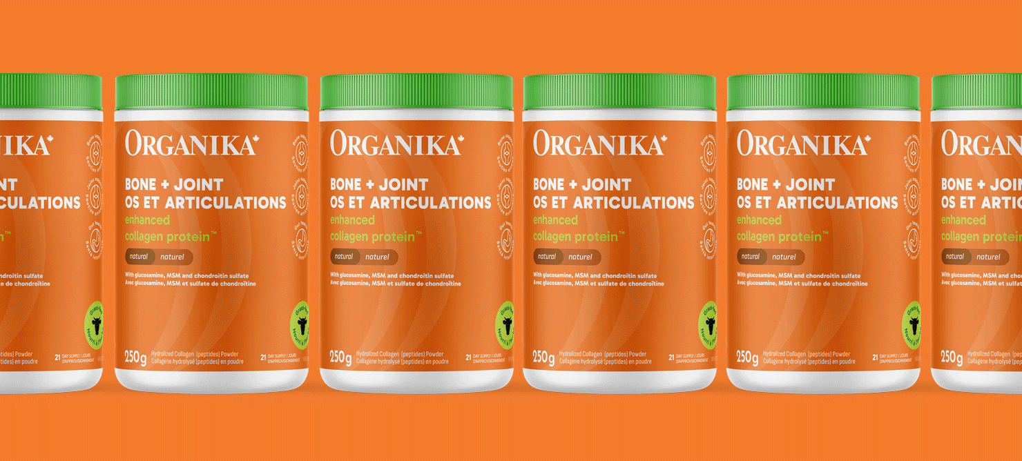
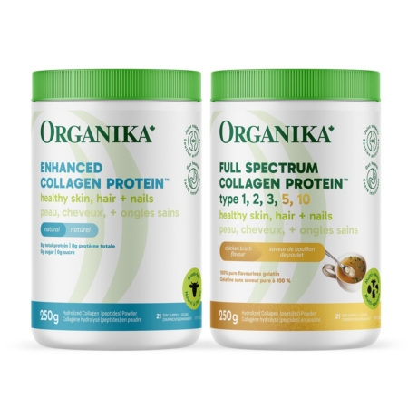
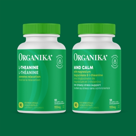
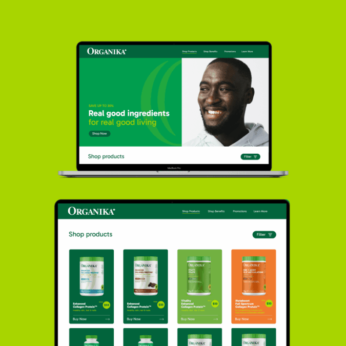
Organika has one of the fastest product development pipelines in the industry, and in order to support their pace of innovation, we were tasked with designing a packaging system that could house ~200 SKUs and accommodate future additions.
Colour Clarity
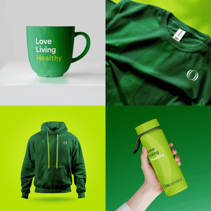
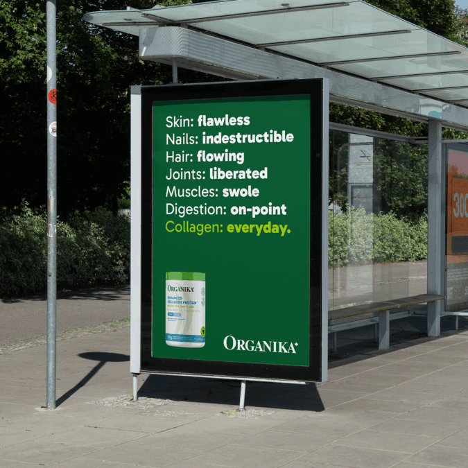
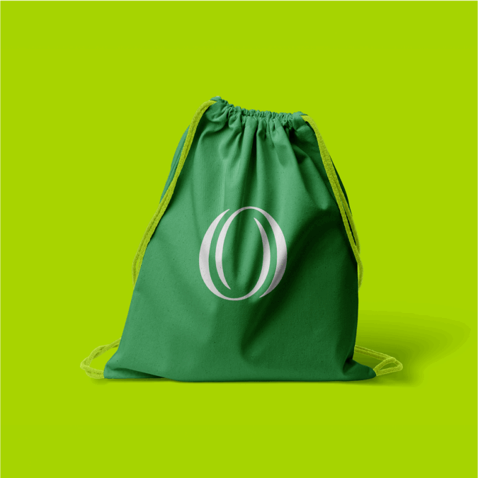
Colour-coded for need-states and ingredients, the new packaging architecture was designed to help in-store consumers navigate the stormy sea that is the supplement aisle. Plus, we preserved the iconic green lid, and honed in on Organika’s “O” logo graphic as the stage setter for the product. Finally, to further dial in on everything the brand has going for it, we let the signature green tones run the show. All green everything.
Guiding Growth
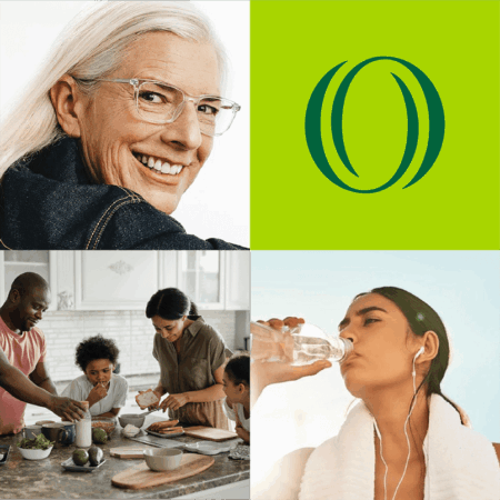
Any brand is only as compelling as its strategic foundation. While a lot goes into the recipe for success, the key is to keep the brand streamlined, focused. With the strategic platform all around being a shoulder to lean on for your wellness needs, the visual and verbal identity followed naturally, emphasizing friendliness, optimism, good humour and an infectious sense of welcome.


Running Partners
A good strategy also needs teams to run with it. And run with it Organika did, taking on the retooled foundation and embodying it brilliantly.
This successful rebrand is testament to an organization that knows what it’s about and loves every inch of its mission. As well as the value of listening to your audience and creating robust guidelines built on the heart of the brand.
